> ## Documentation Index
> Fetch the complete documentation index at: https://docs.scanova.io/llms.txt
> Use this file to discover all available pages before exploring further.
# Animated effects
> Background, card, and button animation effects.
Animated effects add motion overlays to your landing page — particles that float across the background, a light beam that travels around a card's border, or a glow that pulses around a button. Effects are purely visual: they render with `pointer-events: none`, so they never block taps or clicks on the content beneath them.
## Where effects appear
| Target | What it covers | Set from |
| -------------- | ------------------------------------- | --------------------------------------------------------------------------------------------------- |
| **Background** | The full page, behind all blocks | Header **Theme** → **Customise** → **Effects** |
| **Card** | An individual content block's surface | **Customise** → **Effects** (all cards) OR the block's own **Design** tab → **Effects** (one block) |
| **Button** | An individual button block | **Customise** → **Effects** (all buttons) OR the button's own **Design** tab → **Effects** |
## Setting a global effect
A global effect applies to every card or button on the page at once (background effects are always global — there's only one background).
With your page open in the builder, click **Theme** in the header.
On the theme card that's currently applied, click **Customise**. This opens the **Customise · Global** panel in the right-hand sidebar.
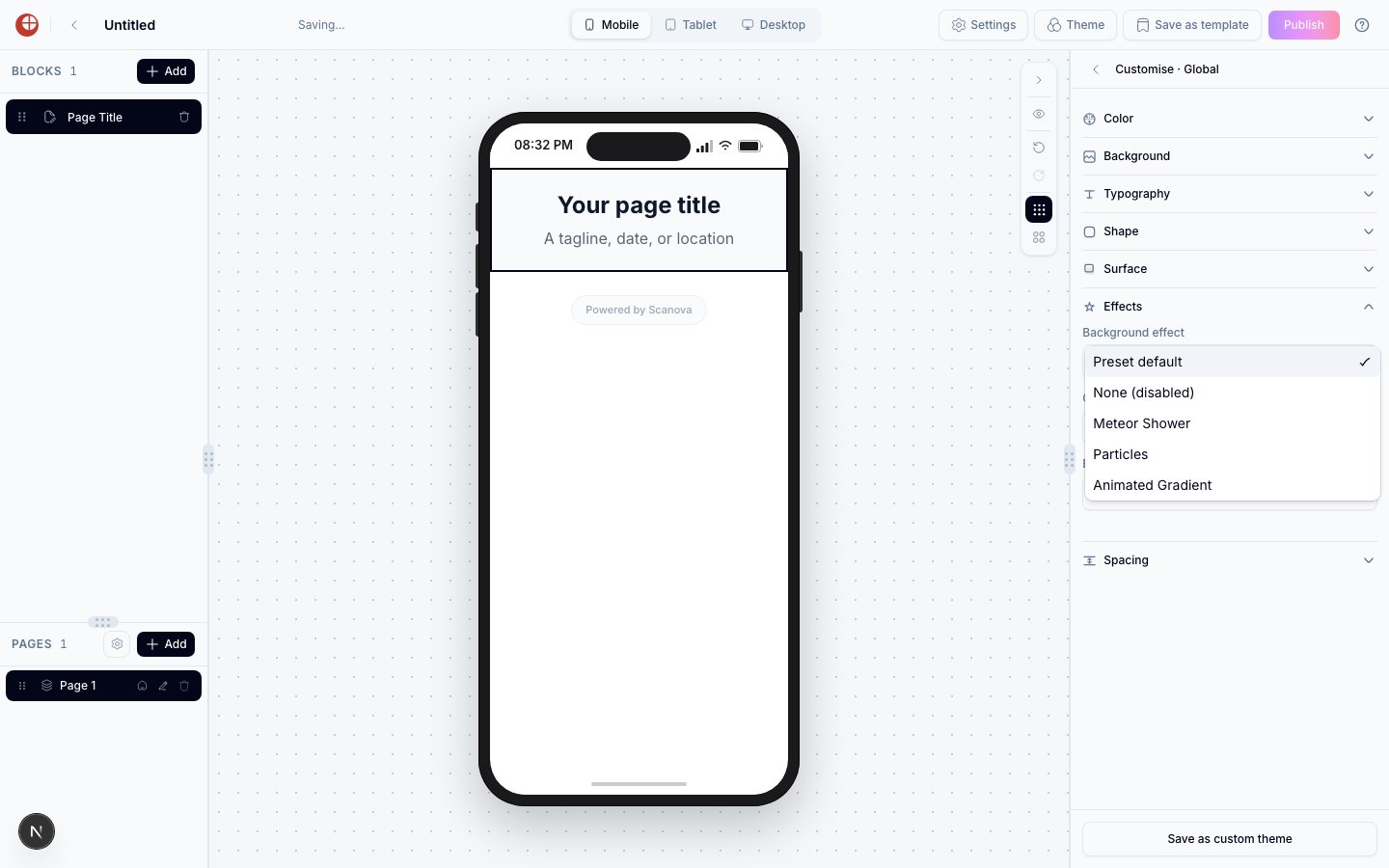
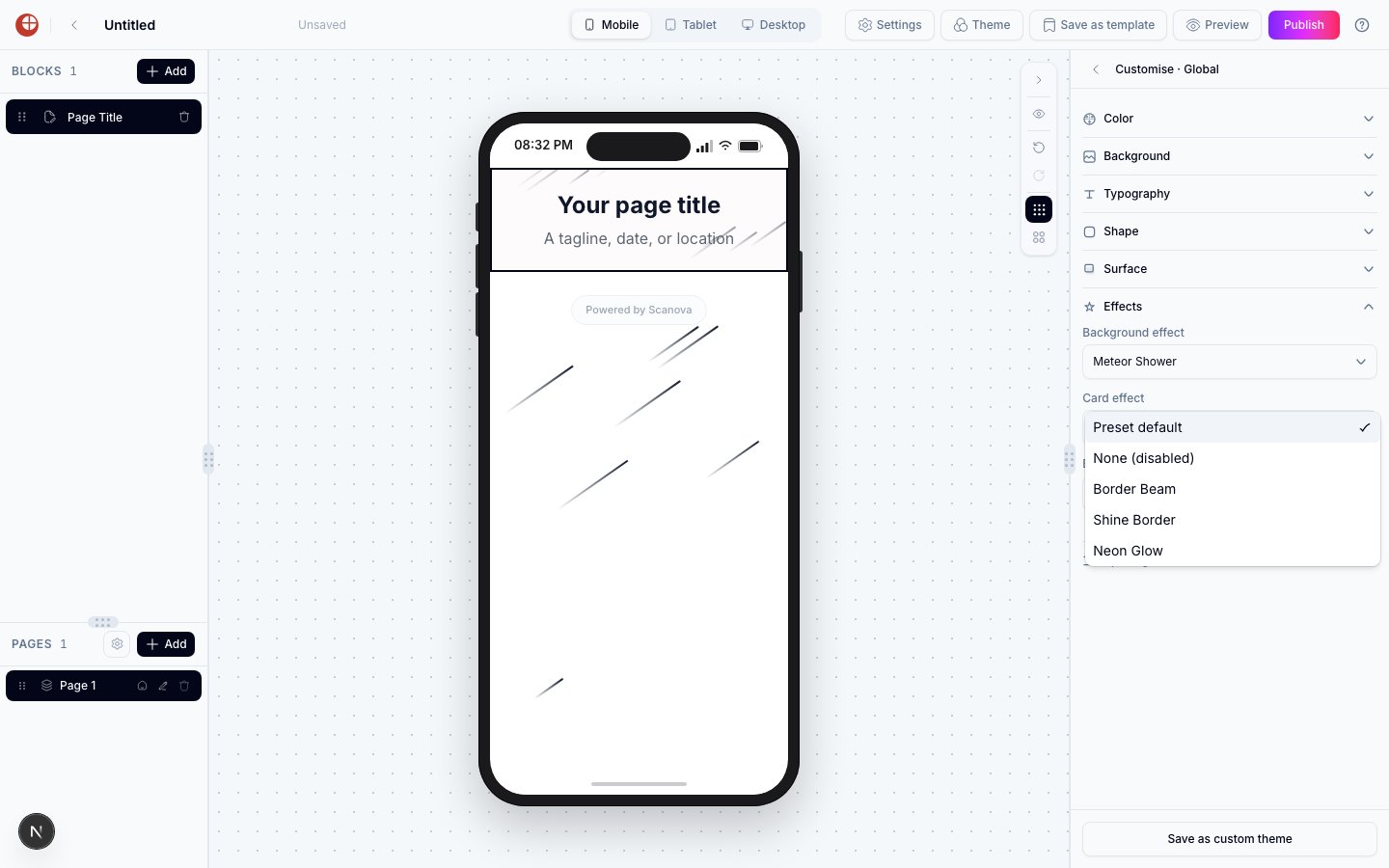
Scroll down and click **Effects** to expand it. You'll see three dropdowns: **Background effect**, **Card effect**, and **Button effect**.
Open a dropdown and choose a named effect. The canvas preview updates immediately, at full visual intensity — exactly as visitors will see it.
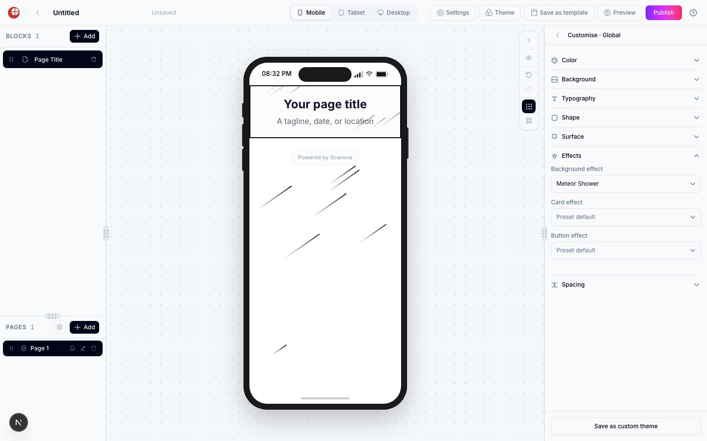 Effects render identically in the canvas and on the published page, so there's nothing further to configure — just publish when you're ready.
To remove a global effect, open the same dropdown and choose **None (disabled)**.
Effects render identically in the canvas and on the published page, so there's nothing further to configure — just publish when you're ready.
To remove a global effect, open the same dropdown and choose **None (disabled)**.
 ## Overriding the effect on a single block
Any individual card or button block can use a different effect than the global setting, or disable effects entirely, without changing the global setting for other blocks.
Click the block in the canvas, or select it from the **Blocks** list on the left.
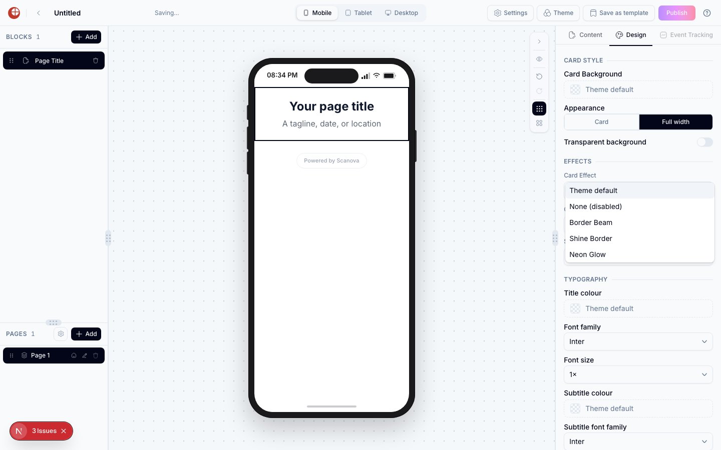
In the right-hand inspector, click **Design**.
Under the **Effects** heading, open the effect dropdown (labelled **Card Effect** or **Button Effect** depending on the block type) and choose:
* **Theme default** — inherits whatever the global setting is. This is the default for every block.
* **None (disabled)** — turns off effects for this block only, even if the global setting has one applied.
* Any named effect — overrides the global setting and uses this effect just for this block.
## Overriding the effect on a single block
Any individual card or button block can use a different effect than the global setting, or disable effects entirely, without changing the global setting for other blocks.
Click the block in the canvas, or select it from the **Blocks** list on the left.
In the right-hand inspector, click **Design**.
Under the **Effects** heading, open the effect dropdown (labelled **Card Effect** or **Button Effect** depending on the block type) and choose:
* **Theme default** — inherits whatever the global setting is. This is the default for every block.
* **None (disabled)** — turns off effects for this block only, even if the global setting has one applied.
* Any named effect — overrides the global setting and uses this effect just for this block.
 This is useful when most cards on a page should have an effect but one — a form or a disclaimer, for example — should stay static and easy to read.
## Available effects
### Background effects
| Effect | Description |
| ----------------- | ---------------------------------------------------------------- |
| Meteor Shower | Diagonal streaks that shoot across the page |
| Particles | Floating dots that drift slowly across the background |
| Animated Gradient | A softly shifting gradient that blends between colours over time |
### Card effects
| Effect | Description |
| ------------ | --------------------------------------------------------------- |
| Border Beam | A light beam that travels continuously around the card's border |
| Shine Border | A soft shine sweep that glides along the card's border |
| Neon Glow | A glowing outline pulsing around the card |
This is useful when most cards on a page should have an effect but one — a form or a disclaimer, for example — should stay static and easy to read.
## Available effects
### Background effects
| Effect | Description |
| ----------------- | ---------------------------------------------------------------- |
| Meteor Shower | Diagonal streaks that shoot across the page |
| Particles | Floating dots that drift slowly across the background |
| Animated Gradient | A softly shifting gradient that blends between colours over time |
### Card effects
| Effect | Description |
| ------------ | --------------------------------------------------------------- |
| Border Beam | A light beam that travels continuously around the card's border |
| Shine Border | A soft shine sweep that glides along the card's border |
| Neon Glow | A glowing outline pulsing around the card |
 ### Button effects
| Effect | Description |
| ------------ | ----------------------------------------------------------------- |
| Border Beam | A light beam that travels continuously around the button's border |
| Shine Border | A soft shine sweep that glides along the button's border |
| Neon Glow | A glowing outline pulsing around the button |
### Button effects
| Effect | Description |
| ------------ | ----------------------------------------------------------------- |
| Border Beam | A light beam that travels continuously around the button's border |
| Shine Border | A soft shine sweep that glides along the button's border |
| Neon Glow | A glowing outline pulsing around the button |
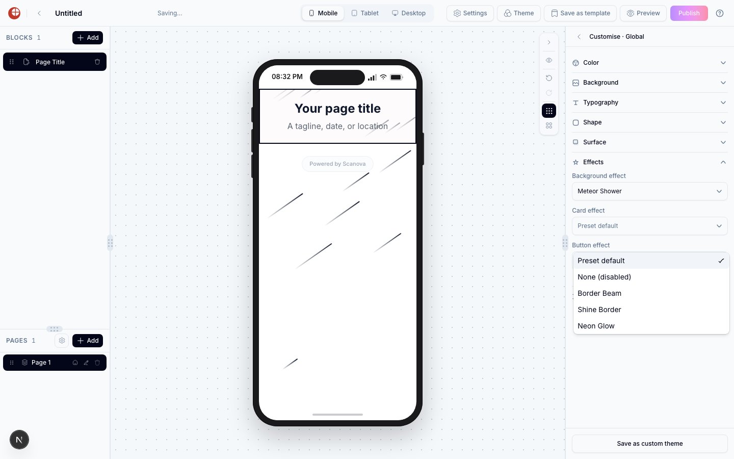 In the global Customise panel, the dropdowns default to **Preset default** (the effect your active theme ships with) rather than **Theme default** — that label is reserved for per-block overrides, where it means "inherit the global setting." Functionally, choosing **None (disabled)** always turns effects off for its scope.
## Canvas preview vs. published page
Effects render at full visual intensity in both the canvas builder and the published landing page — what you see while editing is what visitors see. There's no separate "preview mode" needed to check how an effect looks.
## Performance notes
Effects are lightweight and client-rendered, and they don't call any external service. They run entirely in the browser and have minimal impact on page load time.
## Related
* [Themes](/page-builder/themes) — setting theme-wide default effects from the Customise panel's Effects section.
* [Design options](/page-builder/design-options) — the per-block Effects group that overrides the global setting.
* [Blocks reference](/page-builder/blocks-reference) — the blocks that carry a Card or Button effect.
In the global Customise panel, the dropdowns default to **Preset default** (the effect your active theme ships with) rather than **Theme default** — that label is reserved for per-block overrides, where it means "inherit the global setting." Functionally, choosing **None (disabled)** always turns effects off for its scope.
## Canvas preview vs. published page
Effects render at full visual intensity in both the canvas builder and the published landing page — what you see while editing is what visitors see. There's no separate "preview mode" needed to check how an effect looks.
## Performance notes
Effects are lightweight and client-rendered, and they don't call any external service. They run entirely in the browser and have minimal impact on page load time.
## Related
* [Themes](/page-builder/themes) — setting theme-wide default effects from the Customise panel's Effects section.
* [Design options](/page-builder/design-options) — the per-block Effects group that overrides the global setting.
* [Blocks reference](/page-builder/blocks-reference) — the blocks that carry a Card or Button effect.