> ## Documentation Index
> Fetch the complete documentation index at: https://docs.scanova.io/llms.txt
> Use this file to discover all available pages before exploring further.
# Design options
> Per-block visual customization using the Design tab.
## What Design Options are
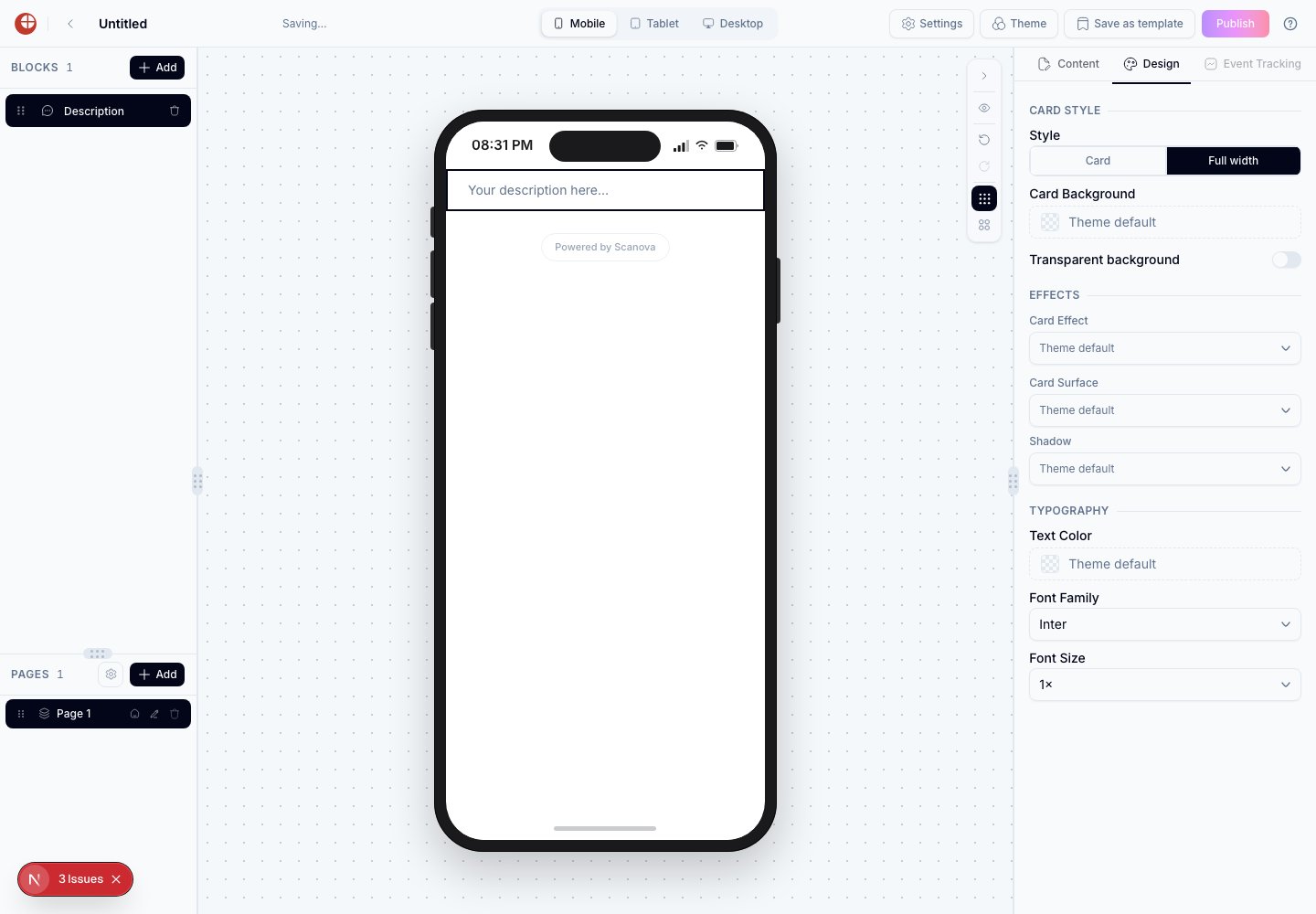
Most blocks have a **Design** tab in the right-hand inspector. Design options let you override the visual style of a single block without changing the rest of the page. When a design field is left empty (showing "Theme default"), the block inherits its value from the active theme instead.
 ## How to access Design Options
Click a block on the canvas or in the left sidebar to select it.
In the right panel, click the **Design** tab. (If a block has no visual style to override, this tab is disabled — for example Footer, Menu, and Contact Details have no Design tab at all.)
The canvas updates in real time.
To reset a field to its theme default, clear it (or reselect "Theme default" from its dropdown).
## Typography
Text style options appear on blocks that contain paragraph text, headings, or labels — Page Title, Description, Event Schedule, Event Venue, Couple Names, and others.
| Option | Description |
| ----------- | ------------------------------------------------------------------------------------------------------------------------------------------------------------------------- |
| Text color | Overrides the color of the block's text. Leave empty to use the theme's foreground color. |
| Font family | Overrides the typeface for this block. Accepts any font in the picker. |
| Font size | A continuous size **multiplier**, not a Small/Medium/Large scale: **0.5×, 0.75×, 1×, 1.25×, 1.5×, 2×, 2.5×, 3×, 3.5×, 4×**. 1× is the theme's default size for that text. |
## How to access Design Options
Click a block on the canvas or in the left sidebar to select it.
In the right panel, click the **Design** tab. (If a block has no visual style to override, this tab is disabled — for example Footer, Menu, and Contact Details have no Design tab at all.)
The canvas updates in real time.
To reset a field to its theme default, clear it (or reselect "Theme default" from its dropdown).
## Typography
Text style options appear on blocks that contain paragraph text, headings, or labels — Page Title, Description, Event Schedule, Event Venue, Couple Names, and others.
| Option | Description |
| ----------- | ------------------------------------------------------------------------------------------------------------------------------------------------------------------------- |
| Text color | Overrides the color of the block's text. Leave empty to use the theme's foreground color. |
| Font family | Overrides the typeface for this block. Accepts any font in the picker. |
| Font size | A continuous size **multiplier**, not a Small/Medium/Large scale: **0.5×, 0.75×, 1×, 1.25×, 1.5×, 2×, 2.5×, 3×, 3.5×, 4×**. 1× is the theme's default size for that text. |
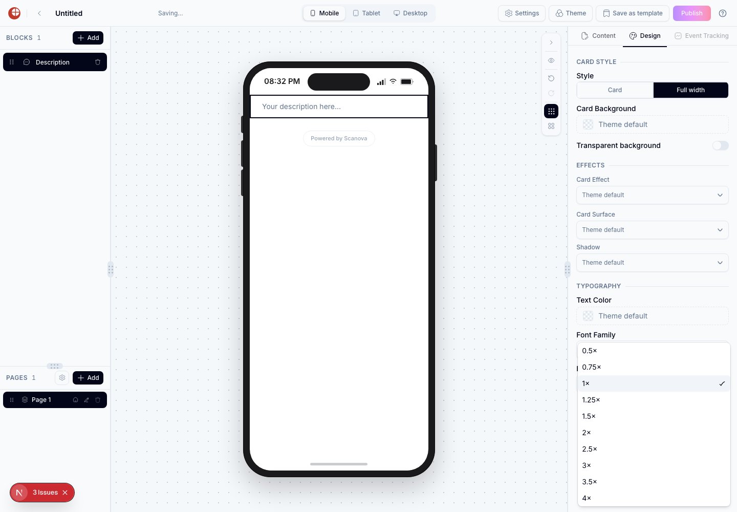 Font Size is **not** a named scale (Small/Medium/Large/Extra Large). It's a numeric multiplier applied to the theme's base size for that text element — pick 1× to keep the theme default, or a higher/lower multiplier to scale it up or down.
## Card style
Card style options control a block's container appearance. These appear together on any block with visible card chrome (Description, Coupon Details, About Us, Brand Info, and most others).
| Option | Description |
| -------------------------------------- | ---------------------------------------------------------------------------------------------------------------------------------------------------------- |
| Style (sometimes labeled "Appearance") | Choose **Card** (an inset panel with a border and shadow) or **Full width** (no outer inset — the block spans the full content width). |
| Card Background | Overrides the background color of the block's card. Leave empty to use the theme's surface color. Has no visible effect when Transparent background is on. |
| Transparent background | Forces a fully see-through background for this block, instead of the theme's surface color — works with either Style setting. |
## Effects (per-block)
In addition to Card Background, most card-based blocks expose three more overrides under an **Effects** group in the Design tab:
| Option | Description |
| ------------ | ---------------------------------------------------------------------------------------------------------------------------------------------------------------------------- |
| Card Effect | Choose "Theme default" to inherit the theme's card effect, or override it for this block only — see [Animated Effects](/page-builder/animated-effects) for the full catalog. |
| Card Surface | Overrides the card's material (defaults to "Theme default") — mirrors the theme-level Surface section's "Card material" control, exposed here on a per-block basis. |
| Shadow | Overrides the shadow variant used for this block's card (defaults to "Theme default") — mirrors the theme-level Surface section's shadow control. |
**Card Surface** and **Shadow** are per-block overrides of the same tokens set globally in the theme's **Surface** section (see [Themes](/page-builder/themes)). Setting them here affects only the selected block; everything else on the page keeps using the theme's values.
## Button styles
Button style options appear on the **Button** block and on blocks with a built-in button (Map, File Download).
| Option | Description |
| ------------- | -------------------------------------------------------------------------- |
| Button color | Background fill color of the button |
| Border color | Color of the button's border |
| Corner radius | A 5-option preset picker — **None, S, M, L, Full** — not a raw pixel value |
| Border width | Thickness of the button border in pixels. Set to 0 to remove the border. |
## Icon styles
Icon style options appear on blocks that display a decorative icon. Confirmed live on the **Event Venue** block (Wedding/Event pages):
| Option | Description |
| ----------- | --------------------------------- |
| Icon colour | Color applied to the block's icon |
Font Size is **not** a named scale (Small/Medium/Large/Extra Large). It's a numeric multiplier applied to the theme's base size for that text element — pick 1× to keep the theme default, or a higher/lower multiplier to scale it up or down.
## Card style
Card style options control a block's container appearance. These appear together on any block with visible card chrome (Description, Coupon Details, About Us, Brand Info, and most others).
| Option | Description |
| -------------------------------------- | ---------------------------------------------------------------------------------------------------------------------------------------------------------- |
| Style (sometimes labeled "Appearance") | Choose **Card** (an inset panel with a border and shadow) or **Full width** (no outer inset — the block spans the full content width). |
| Card Background | Overrides the background color of the block's card. Leave empty to use the theme's surface color. Has no visible effect when Transparent background is on. |
| Transparent background | Forces a fully see-through background for this block, instead of the theme's surface color — works with either Style setting. |
## Effects (per-block)
In addition to Card Background, most card-based blocks expose three more overrides under an **Effects** group in the Design tab:
| Option | Description |
| ------------ | ---------------------------------------------------------------------------------------------------------------------------------------------------------------------------- |
| Card Effect | Choose "Theme default" to inherit the theme's card effect, or override it for this block only — see [Animated Effects](/page-builder/animated-effects) for the full catalog. |
| Card Surface | Overrides the card's material (defaults to "Theme default") — mirrors the theme-level Surface section's "Card material" control, exposed here on a per-block basis. |
| Shadow | Overrides the shadow variant used for this block's card (defaults to "Theme default") — mirrors the theme-level Surface section's shadow control. |
**Card Surface** and **Shadow** are per-block overrides of the same tokens set globally in the theme's **Surface** section (see [Themes](/page-builder/themes)). Setting them here affects only the selected block; everything else on the page keeps using the theme's values.
## Button styles
Button style options appear on the **Button** block and on blocks with a built-in button (Map, File Download).
| Option | Description |
| ------------- | -------------------------------------------------------------------------- |
| Button color | Background fill color of the button |
| Border color | Color of the button's border |
| Corner radius | A 5-option preset picker — **None, S, M, L, Full** — not a raw pixel value |
| Border width | Thickness of the button border in pixels. Set to 0 to remove the border. |
## Icon styles
Icon style options appear on blocks that display a decorative icon. Confirmed live on the **Event Venue** block (Wedding/Event pages):
| Option | Description |
| ----------- | --------------------------------- |
| Icon colour | Color applied to the block's icon |
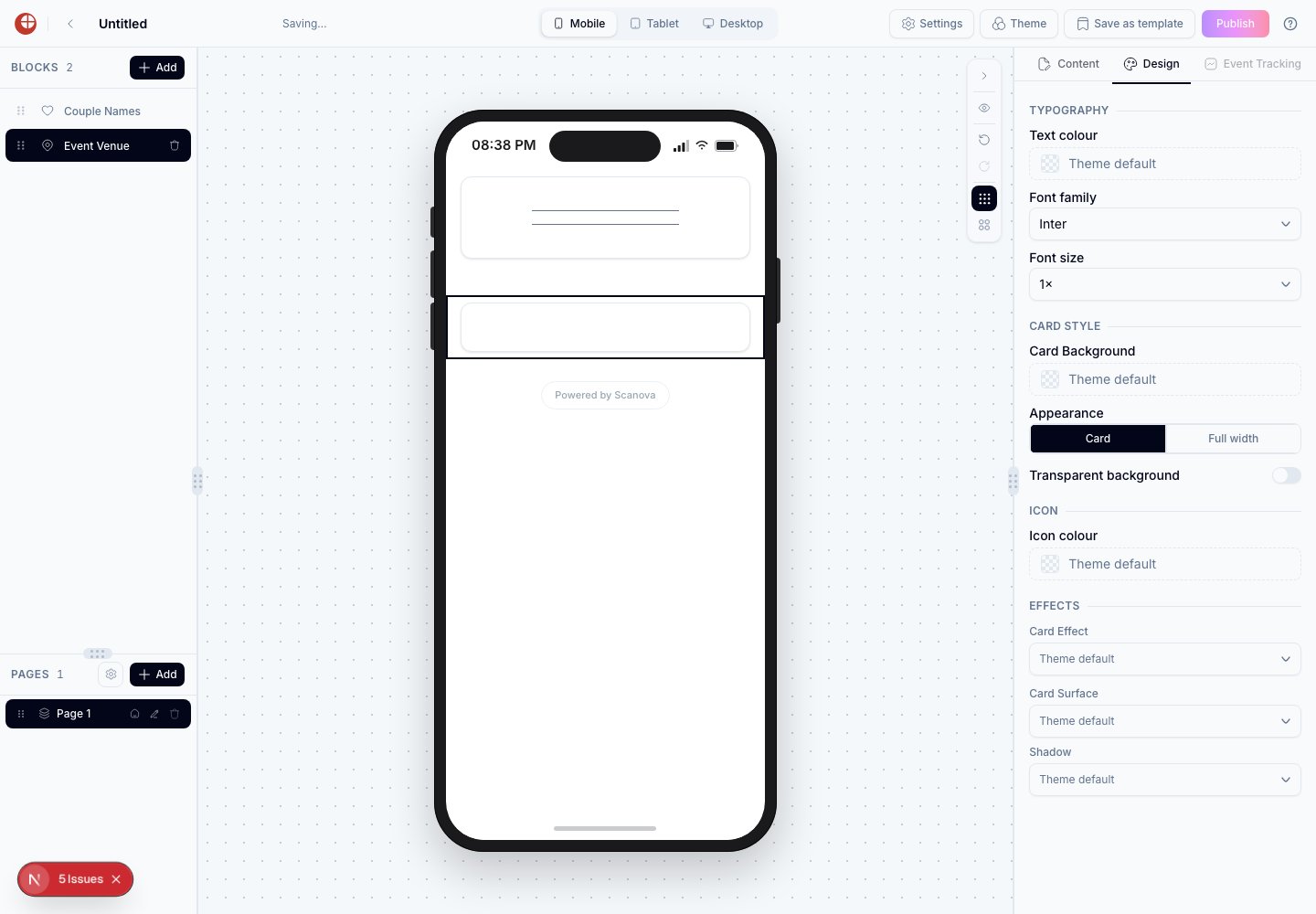 Not every block with an icon has this control — for example, Contact Us shows icons but has no Icon colour override in its Design tab.
## Separator styles
Separator style options appear on blocks that include a built-in decorative line. Confirmed live on the **Couple Names** block (Wedding pages):
| Option | Description |
| ---------------- | --------------------------------------------------------- |
| Separator style | Chooses the visual design of the separator (styles 01–09) |
| Separator colour | Color of the separator line |
Not every block with an icon has this control — for example, Contact Us shows icons but has no Icon colour override in its Design tab.
## Separator styles
Separator style options appear on blocks that include a built-in decorative line. Confirmed live on the **Couple Names** block (Wedding pages):
| Option | Description |
| ---------------- | --------------------------------------------------------- |
| Separator style | Chooses the visual design of the separator (styles 01–09) |
| Separator colour | Color of the separator line |
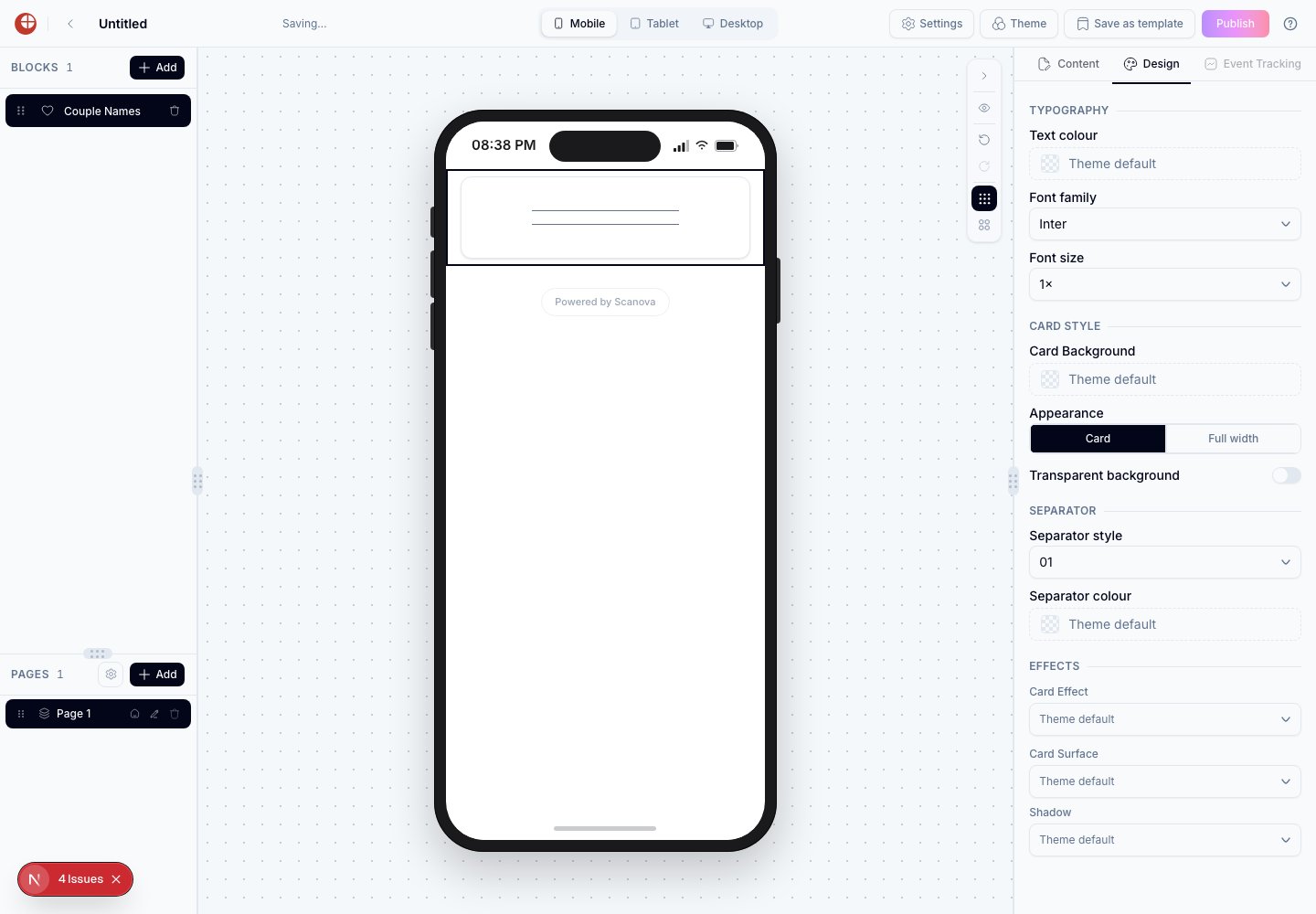 These differ from the standalone **Separator** block — they're decorative lines built into specific blocks.
## Page-level effects
Many blocks' Effects group lets that block override the theme's default background, card, or button effect for itself only. See [Animated Effects](/page-builder/animated-effects) for the full list and how to set the theme-wide defaults.
## Precedence
Design options follow this priority order (highest to lowest):
1. Per-block Design tab setting (if set)
2. Page-level theme override (in the Theme picker's Customise panel)
3. Preset theme default
An empty field in the Design tab means "use the theme value." A non-empty field overrides the theme for that block only.
## Tips
* Use per-block overrides sparingly. Overriding too many blocks individually makes the page look inconsistent. Apply most customization through the theme, and reserve block overrides for specific emphasis.
* To highlight a single Button block, give it a distinct button color while leaving all other blocks at their theme defaults.
* If you want a block to stand out — for a call-out section or important information — set its Card Background explicitly rather than changing the whole theme.
## Related
* [Themes](/page-builder/themes) — the page-level tokens these per-block overrides fall back to.
* [Animated effects](/page-builder/animated-effects) — the full catalog behind the Card Effect and Button Effect options.
* [Blocks reference](/page-builder/blocks-reference) — which blocks expose a Design tab at all.
These differ from the standalone **Separator** block — they're decorative lines built into specific blocks.
## Page-level effects
Many blocks' Effects group lets that block override the theme's default background, card, or button effect for itself only. See [Animated Effects](/page-builder/animated-effects) for the full list and how to set the theme-wide defaults.
## Precedence
Design options follow this priority order (highest to lowest):
1. Per-block Design tab setting (if set)
2. Page-level theme override (in the Theme picker's Customise panel)
3. Preset theme default
An empty field in the Design tab means "use the theme value." A non-empty field overrides the theme for that block only.
## Tips
* Use per-block overrides sparingly. Overriding too many blocks individually makes the page look inconsistent. Apply most customization through the theme, and reserve block overrides for specific emphasis.
* To highlight a single Button block, give it a distinct button color while leaving all other blocks at their theme defaults.
* If you want a block to stand out — for a call-out section or important information — set its Card Background explicitly rather than changing the whole theme.
## Related
* [Themes](/page-builder/themes) — the page-level tokens these per-block overrides fall back to.
* [Animated effects](/page-builder/animated-effects) — the full catalog behind the Card Effect and Button Effect options.
* [Blocks reference](/page-builder/blocks-reference) — which blocks expose a Design tab at all.