> ## Documentation Index
> Fetch the complete documentation index at: https://docs.scanova.io/llms.txt
> Use this file to discover all available pages before exploring further.
# Themes
> Choose and customize a theme with 21 preset styles and full token-level overrides.
## What a theme controls
A theme controls the overall visual style of a landing page: background color, surface color, text color, accent color, font, corner radius, and shadow/surface style. Switching themes instantly updates every block on the page — themes never change your content, only how it looks.
## Opening the theme picker
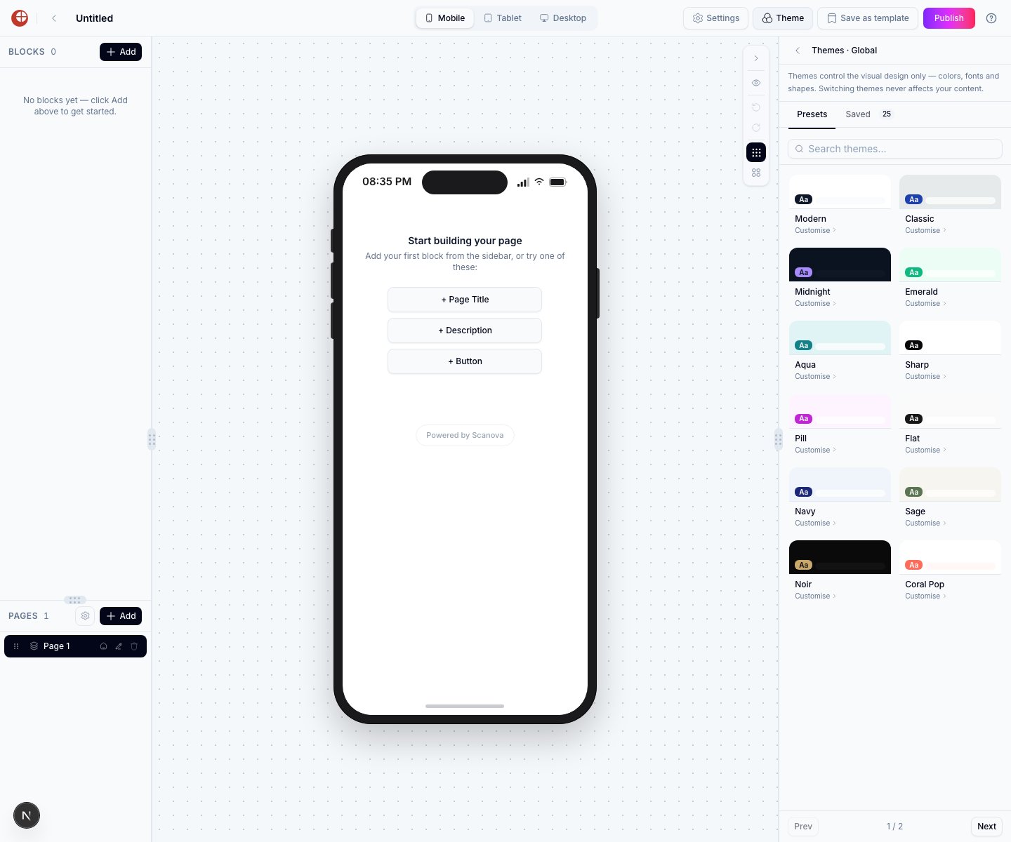
Click the **Theme** button in the Page Builder header. The theme picker opens in the right panel, showing preset themes (**Presets** tab) and any themes you've saved (**Saved** tab).
## Preset themes
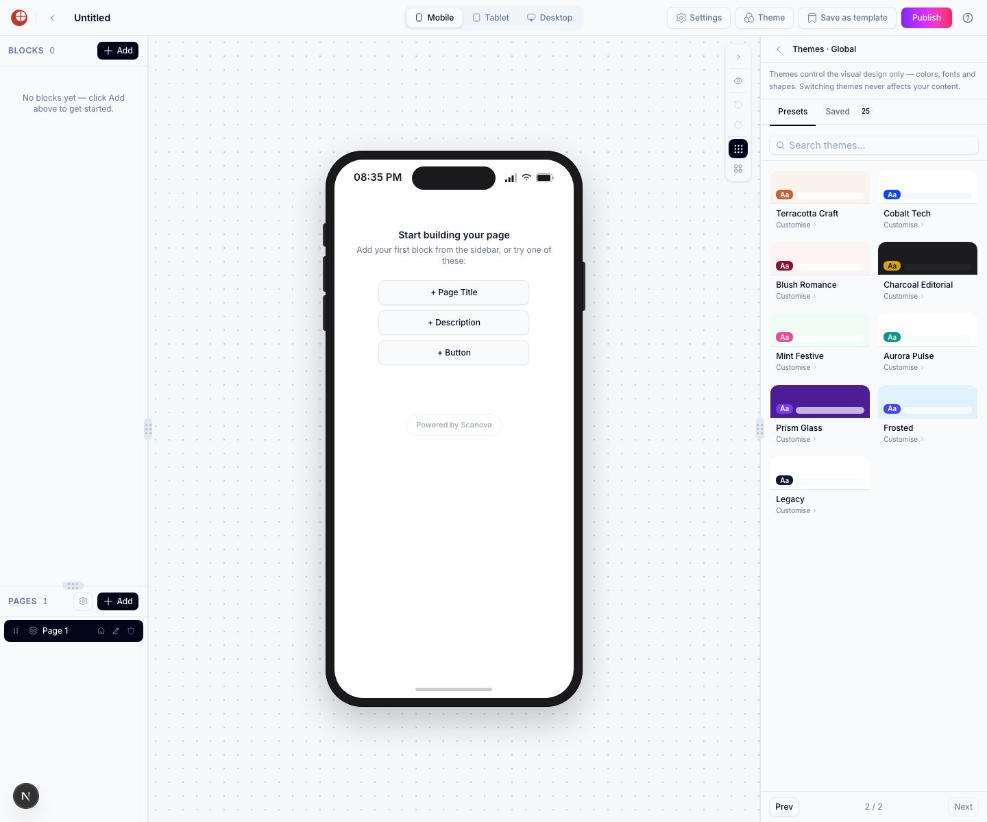
The picker has **21 preset themes**, spread across two pages of 12 and 9 cards.
 | Page | Preset themes |
| ---- | -------------------------------------------------------------------------------------------------------------------------- |
| 1 | Modern, Classic, Midnight, Emerald, Aqua, Sharp, Pill, Flat, Navy, Sage, Noir, Coral Pop |
| 2 | Terracotta Craft, Cobalt Tech, Blush Romance, Charcoal Editorial, Mint Festive, Aurora Pulse, Prism Glass, Frosted, Legacy |
Older documentation described "Ten preset themes" and listed **Royal, Retro, Sunset**, and **Mono Dark** among them. None of those four exist in the current picker — the catalog has since grown to 21 presets, six of which (Modern, Classic, Midnight, Emerald, Navy, Aqua) carry over from the original ten.
Click any theme card to apply it. The canvas updates immediately so you can compare themes without leaving the editor.
## Theme overrides
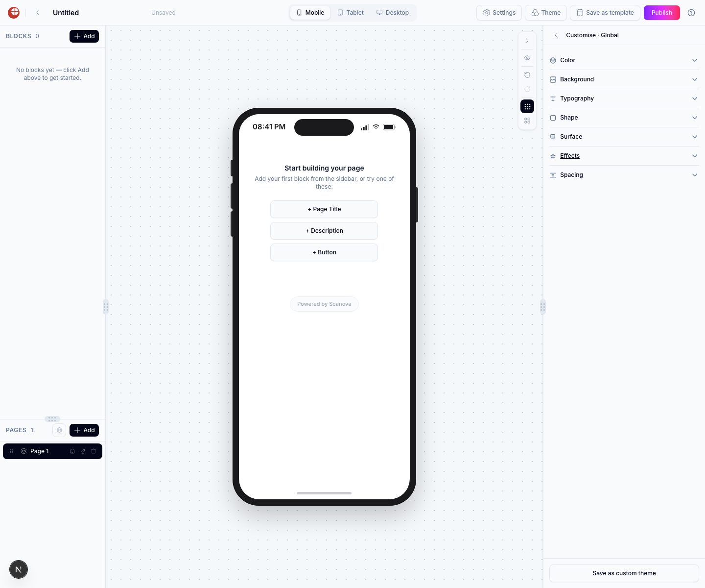
After selecting a preset, click **Customise** on its card to open a panel where you can independently override any of the theme's design tokens without changing the base preset. The panel is organized into seven sections, in this order:
| Page | Preset themes |
| ---- | -------------------------------------------------------------------------------------------------------------------------- |
| 1 | Modern, Classic, Midnight, Emerald, Aqua, Sharp, Pill, Flat, Navy, Sage, Noir, Coral Pop |
| 2 | Terracotta Craft, Cobalt Tech, Blush Romance, Charcoal Editorial, Mint Festive, Aurora Pulse, Prism Glass, Frosted, Legacy |
Older documentation described "Ten preset themes" and listed **Royal, Retro, Sunset**, and **Mono Dark** among them. None of those four exist in the current picker — the catalog has since grown to 21 presets, six of which (Modern, Classic, Midnight, Emerald, Navy, Aqua) carry over from the original ten.
Click any theme card to apply it. The canvas updates immediately so you can compare themes without leaving the editor.
## Theme overrides
After selecting a preset, click **Customise** on its card to open a panel where you can independently override any of the theme's design tokens without changing the base preset. The panel is organized into seven sections, in this order:
 ### Color
Override the theme's color tokens individually: Background, Surface, Surface alt, Accent, Button text (accent foreground), Heading, Body, Muted, and Border. Each field falls back to the preset's value when left empty.
### Background
Choose how the page background is rendered — a solid Color, a Gradient (angle and color stops), an Image (with fit and opacity controls), or a Video (with opacity control) — plus a background effect (see [Animated Effects](/page-builder/animated-effects)).
**Block transparency** — when a background effect is active, this slider controls how much a "Full width" block's own surface fades to let the effect show through underneath it. It applies regardless of background type.
### Typography
Override the font family separately for headings, body text, and labels/buttons. Pick from the built-in font list, or type any Google Font name (for example `Montserrat` or `Roboto`) to use it instead of the preset's default stack.
Font overrides here apply to any block that doesn't have its own per-block font setting. A block's own [Design tab](/page-builder/design-options) font, when set, takes priority over this theme-level override.
### Shape
Override the corner radius independently for buttons, cards, images, and inputs.
### Surface
Override the shadow and surface style used for cards and elevated blocks, including a **Card material** control (Preset default / Card / Subtle / Elevated) alongside the shadow-variant control.
This section was previously named "Shadow" in older documentation. It's now labeled **Surface** and also exposes a Card material control in addition to the shadow variant. The same Card Surface and Shadow tokens can be overridden per block — see [Design Options](/page-builder/design-options).
### Effects
Set the theme-wide default background, card, and button effects. See [Animated Effects](/page-builder/animated-effects) for the full catalog.
### Spacing
Control how much breathing room the page uses.
* **Space between blocks** — the vertical gap that separates each block on the page.
* **Spacing scale** — a slider that makes all spacing on the page tighter or roomier at once (gaps, card padding, block spacing) without changing text size. Leave it at the default for the theme's density, or adjust it for an airier or denser layout.
## Dark and light mode
Themes are defined with a fixed color palette — they don't automatically switch between dark and light mode based on the visitor's device preference. If you want a dark page, choose a dark preset (for example Midnight or Noir) or set a dark background color using the override.
## Per-block design overrides
In addition to page-level themes, many blocks have their own Design tab in the inspector where you can override colors, fonts, and card style for that block only. See [Design Options](/page-builder/design-options) for details.
## Resetting overrides
To remove an override and return to the theme default, clear the field in the Customise panel. An empty field tells the page to use the theme's value.
## Related
* [Design options](/page-builder/design-options) — per-block overrides of the same tokens set here.
* [Animated effects](/page-builder/animated-effects) — background, card, and button effects set from the Effects section.
* [Page Builder overview](/page-builder/overview) — where the Theme button lives in the editor header.
### Color
Override the theme's color tokens individually: Background, Surface, Surface alt, Accent, Button text (accent foreground), Heading, Body, Muted, and Border. Each field falls back to the preset's value when left empty.
### Background
Choose how the page background is rendered — a solid Color, a Gradient (angle and color stops), an Image (with fit and opacity controls), or a Video (with opacity control) — plus a background effect (see [Animated Effects](/page-builder/animated-effects)).
**Block transparency** — when a background effect is active, this slider controls how much a "Full width" block's own surface fades to let the effect show through underneath it. It applies regardless of background type.
### Typography
Override the font family separately for headings, body text, and labels/buttons. Pick from the built-in font list, or type any Google Font name (for example `Montserrat` or `Roboto`) to use it instead of the preset's default stack.
Font overrides here apply to any block that doesn't have its own per-block font setting. A block's own [Design tab](/page-builder/design-options) font, when set, takes priority over this theme-level override.
### Shape
Override the corner radius independently for buttons, cards, images, and inputs.
### Surface
Override the shadow and surface style used for cards and elevated blocks, including a **Card material** control (Preset default / Card / Subtle / Elevated) alongside the shadow-variant control.
This section was previously named "Shadow" in older documentation. It's now labeled **Surface** and also exposes a Card material control in addition to the shadow variant. The same Card Surface and Shadow tokens can be overridden per block — see [Design Options](/page-builder/design-options).
### Effects
Set the theme-wide default background, card, and button effects. See [Animated Effects](/page-builder/animated-effects) for the full catalog.
### Spacing
Control how much breathing room the page uses.
* **Space between blocks** — the vertical gap that separates each block on the page.
* **Spacing scale** — a slider that makes all spacing on the page tighter or roomier at once (gaps, card padding, block spacing) without changing text size. Leave it at the default for the theme's density, or adjust it for an airier or denser layout.
## Dark and light mode
Themes are defined with a fixed color palette — they don't automatically switch between dark and light mode based on the visitor's device preference. If you want a dark page, choose a dark preset (for example Midnight or Noir) or set a dark background color using the override.
## Per-block design overrides
In addition to page-level themes, many blocks have their own Design tab in the inspector where you can override colors, fonts, and card style for that block only. See [Design Options](/page-builder/design-options) for details.
## Resetting overrides
To remove an override and return to the theme default, clear the field in the Customise panel. An empty field tells the page to use the theme's value.
## Related
* [Design options](/page-builder/design-options) — per-block overrides of the same tokens set here.
* [Animated effects](/page-builder/animated-effects) — background, card, and button effects set from the Effects section.
* [Page Builder overview](/page-builder/overview) — where the Theme button lives in the editor header.