Add entrance animations and hover effects to your blocks, control their timing, and keep a page feeling lively without ever making it tiring to read through.
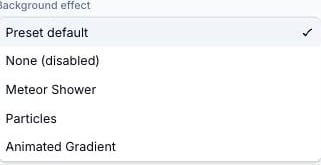
Animated effects add motion overlays to your landing page — particles that float across the background, a light beam that travels around a card’s border, or a glow that pulses around a button. Effects are purely visual: they render with pointer-events: none, so they never block taps or clicks on the content beneath them.
Any individual card or button block can use a different effect than the global setting, or disable effects entirely, without changing the global setting for other blocks.
1
Select the block
Click the block in the canvas, or select it from the Blocks list on the left.
2
Open the block's Design tab
In the right-hand inspector, click Design.
3
Expand Effects and choose an option
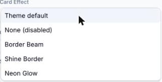
Under the Effects heading, open the effect dropdown (labelled Card Effect or Button Effect depending on the block type) and choose:
Theme default — inherits whatever the global setting is. This is the default for every block.
None (disabled) — turns off effects for this block only, even if the global setting has one applied
Any named effect — overrides the global setting and uses this effect just for this block
A block's own Design tab, with its Card Effect dropdown open
This is useful when most cards on a page should have an effect but one — a form or a disclaimer, for example — should stay static and easy to read.
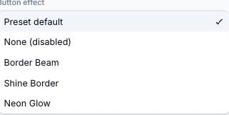
A light beam that travels continuously around the button’s border
Shine Border
A soft shine sweep that glides along the button’s border
Neon Glow
A glowing outline pulsing around the button
The Button effect dropdown
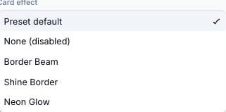
In the global Customise panel, the dropdowns default to Preset default (the effect your active theme ships with) rather than Theme default — that label is reserved for per-block overrides, where it means “inherit the global setting.” Functionally, choosing None (disabled) always turns effects off for its scope.
Effects render at full visual intensity in both the canvas builder and the published landing page — what you see while editing is what visitors see. There’s no separate “preview mode” needed to check how an effect looks.
Effects are lightweight and client-rendered, and they don’t call any external service. They run entirely in the browser and have minimal impact on page load time.