

What blocks are
Blocks are the individual sections that make up a landing page — a heading, a paragraph, a gallery, a form. You add them from the left sidebar, drag to reorder, and edit each one’s content and appearance in the right-hand inspector. Every block has a Content tab for its data (text, images, links). Most blocks also have a Design tab for per-block style overrides, and an Event Tracking tab for click/conversion tracking.Most card-based blocks share the same four Design-tab controls — Appearance (Card / Full width), Card Background, Card Surface, and Shadow — plus a Transparent background switch. Rather than repeating this on every block below, see Design Options for what each control does. If a block has no Design tab at all (for example Footer or Menu), it has no style overrides to set.
Adding a block
- Click + Add at the top of the Blocks list in the left sidebar.
- The Add a block picker opens, showing every block available for the current page type — filter by category tab, or search by name.
- Click a block’s card to add it to the bottom of the page.
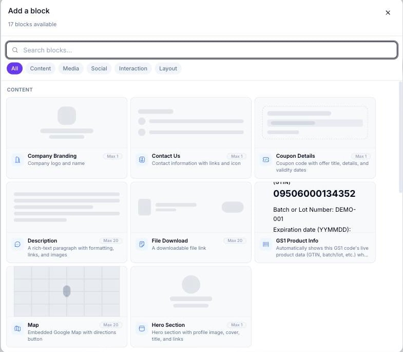
The Add a block picker on a blank page, showing the Content category and its category tabs (All, Content, Media, Social, Interaction, Layout)
Content blocks
Text, branding, and profile blocks that make up the core information on a page.Hero Section was previously called “Page Header” in older documentation. The block type slug (
page_header) is unchanged, but the on-screen label is now Hero Section.Media blocks
Images, video, audio, and downloadable files.Social blocks
Ways for visitors to follow or share your page.Interaction blocks
Blocks that let visitors take action — fill in a form, redeem a coupon, or leave a review.Layout blocks
Structural elements that control page flow, spacing, and advanced behavior.Reordering blocks
Drag the grip handle on any block card in the left sidebar to move it to a new position. The canvas updates in real time.Deleting a block
Select a block on the canvas or in the left sidebar, then click the trash icon in the block card header. Most blocks can be deleted freely — including Page Title and Coupon Details, despite older documentation claiming otherwise. A small number of blocks that anchor a specific page type still can’t be deleted: Audio Player (on Audio pages), Logo Section (on Feedback pages), Menu (on Restaurant pages), and Agent Profile (on Real Estate pages).Copying and pasting a block
Select a block and press Cmd/Ctrl+C to copy it. Press Cmd/Ctrl+V to paste a copy below the current selection. Pasted blocks keep the same content and design settings as the original.Related
- Design options — the per-block Design tab controls referenced throughout this page
- Animated effects — the Card Effect and Button Effect options available on card and button blocks
- Page types — which page type unlocks which category-specific blocks
- Building a form — configuring the Custom Form block’s questions in the dedicated form builder