

What Design Options are
Most blocks have a Design tab in the right-hand inspector. Design options let you override the visual style of a single block without changing the rest of the page. When a design field is left empty (showing “Theme default”), the block inherits its value from the active theme instead.This page covers the destination page’s per-block design — not the QR Code’s own scannable pattern (colors, logo, frame). For that, see Custom QR Code design.
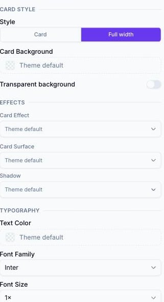
The Design tab on a Description block, showing the Card Style, Effects, and Typography groups
How to access Design Options
1
Select a block
Click a block on the canvas or in the left sidebar to select it.
2
Open the Design tab
In the right panel, click the Design tab. (If a block has no visual style to override, this tab is disabled — for example Footer, Menu, and Contact Details have no Design tab at all.)
3
Adjust an option
The canvas updates in real time.
Typography
Text style options appear on blocks that contain paragraph text, headings, or labels — Page Title, Description, Event Schedule, Event Venue, Couple Names, and others.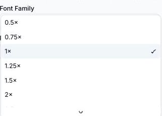
The Font Size dropdown open on a block's Design tab, showing the full 0.5×–4× multiplier list
Card style
Card style options control a block’s container appearance. These appear together on any block with visible card chrome (Description, Coupon Details, About Us, Brand Info, and most others).Effects (per-block)
In addition to Card Background, most card-based blocks expose three more overrides under an Effects group in the Design tab:Card Surface and Shadow are per-block overrides of the same tokens set globally in the theme’s Surface section (see Themes). Setting them here affects only the selected block; everything else on the page keeps using the theme’s values.
Button styles
Button style options appear on the Button block and on blocks with a built-in button (Map, File Download).Icon styles
Icon style options appear on blocks that display a decorative icon. For example, on the Event Venue block (Wedding and Event pages):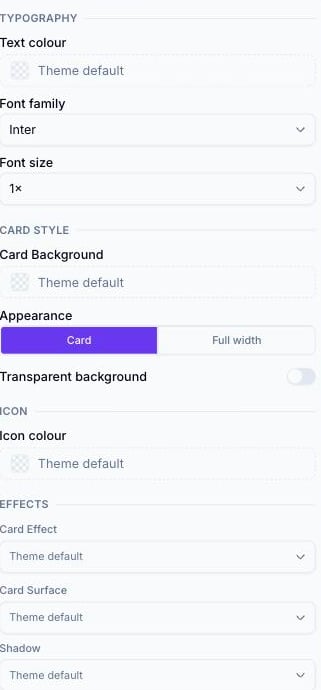
Event Venue's Design tab, showing the Icon colour field under an ICON group
Not every block with an icon has this control — for example, Contact Us shows icons but has no Icon colour override in its Design tab.
Separator styles
Separator style options appear on blocks that include a built-in decorative line. For example, on the Couple Names block (Wedding pages):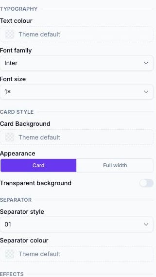
Couple Names' Design tab, showing the SEPARATOR group with Separator style and Separator colour
Page-level effects
Many blocks’ Effects group lets that block override the theme’s default background, card, or button effect for itself only. See Animated Effects for the full list and how to set the theme-wide defaults.Precedence
Design options follow this priority order (highest to lowest):- Per-block Design tab setting (if set)
- Page-level theme override (in the Theme picker’s Customise panel)
- Preset theme default
Tips
- Use per-block overrides sparingly. Overriding too many blocks individually makes the page look inconsistent. Apply most customization through the theme, and reserve block overrides for specific emphasis.
- To highlight a single Button block, give it a distinct button color while leaving all other blocks at their theme defaults
- If you want a block to stand out — for a call-out section or important information — set its Card Background explicitly rather than changing the whole theme
Related
- Themes — the page-level tokens these per-block overrides fall back to
- Animated effects — the full catalog behind the Card Effect and Button Effect options
- Blocks reference — which blocks expose a Design tab at all